
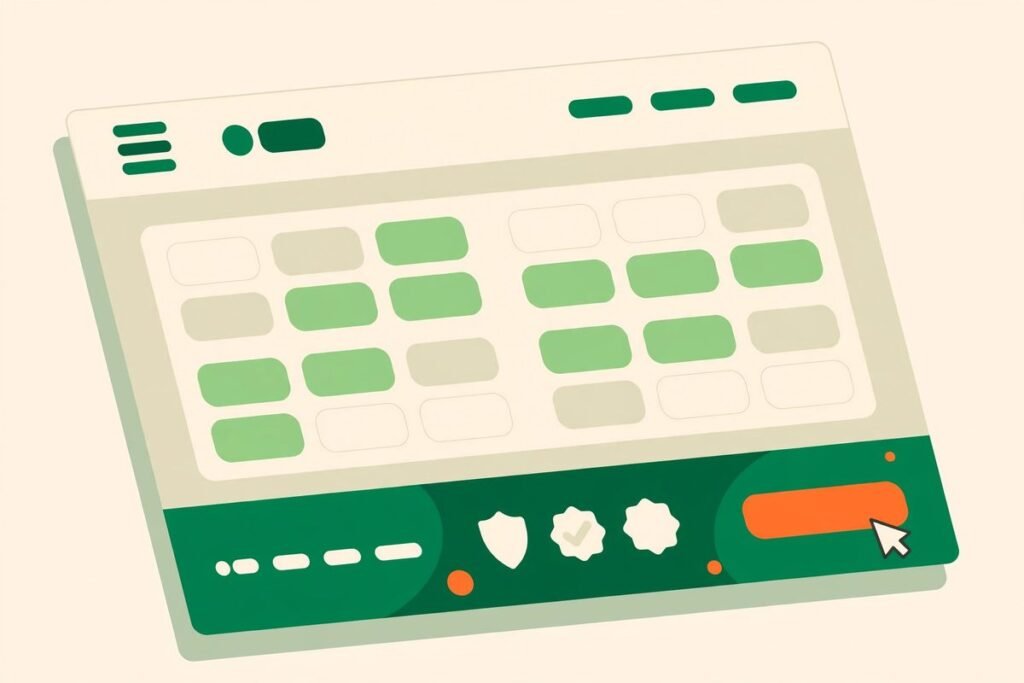
Website footer optimization conversions do not come from a prettier footer. They come from treating the last block on every page as a second chance to convert the visitor who scrolled past everything else. That visitor is not lost. They read your page, they did not click your main call to action, and now they are looking for one more reason to trust you, one more page worth reading, or one easier way to get in touch. A well-built footer gives them all three in under ten seconds.
This guide is for business owners and marketing managers who already have a decent website but suspect the bottom of every page is doing nothing for them. By the end, you will know exactly what belongs in a footer, what to cut, how to measure whether it is working, and which mistakes quietly cost enquiries every week.
Website footer optimization conversions: what actually moves the needle
Start with why the footer matters more than its position suggests. The footer appears on every page of your site, which makes it one of the most-viewed blocks you own. Analytics on typical business sites consistently show that a meaningful share of visitors reach the bottom of key pages, and those visitors are disproportionately high-intent: they are comparison shoppers, procurement researchers, and people checking whether a company is real before they fill in a form.
That changes what the footer is for. It is not a dumping ground for links you could not fit elsewhere. It is the last impression, the trust checkpoint, and the safety net for every visitor your main content did not convert. Three things move the needle: findability (can a visitor reach the page or contact route they actually want?), credibility (does this look like a real, established business?), and a low-friction next step (is there an action that fits someone who is still researching, not yet ready to buy?). Every decision below serves one of those three.
The anatomy of a footer that sells
A strong footer has four or five columns at most, each with a clear job. More than that and visitors stop scanning and start ignoring. A structure that works for most service businesses looks like this:
- About in one line. A single sentence saying what you do and who you serve, not a paragraph. This orients the visitor who landed deep in your site from search.
- Services. Your five to eight most important service pages, with the exact names visitors recognise. This is also your best internal-linking real estate, so link to real pages, not generic labels.
- Company. About, case studies or work, careers, and contact. These are the pages a sceptical visitor checks before trusting you.
- Contact, plainly stated. A real phone number, a real email address, and a town or city. A contact form link alone is not enough; people who are ready to talk want to see that a human exists.
- Legal, kept small. Privacy policy, terms, and cookie settings belong here, in smaller text, clearly separated from the selling columns.
Order matters too. Put the column a researching visitor wants first, usually services or company, and keep legal links last. And if your site was built as a professionally designed business website, the footer should match the rest of the design system: same type scale, same spacing rhythm, same button style. A footer that looks bolted on reads as an afterthought, and visitors treat it as one.
Trust signals that close the sale
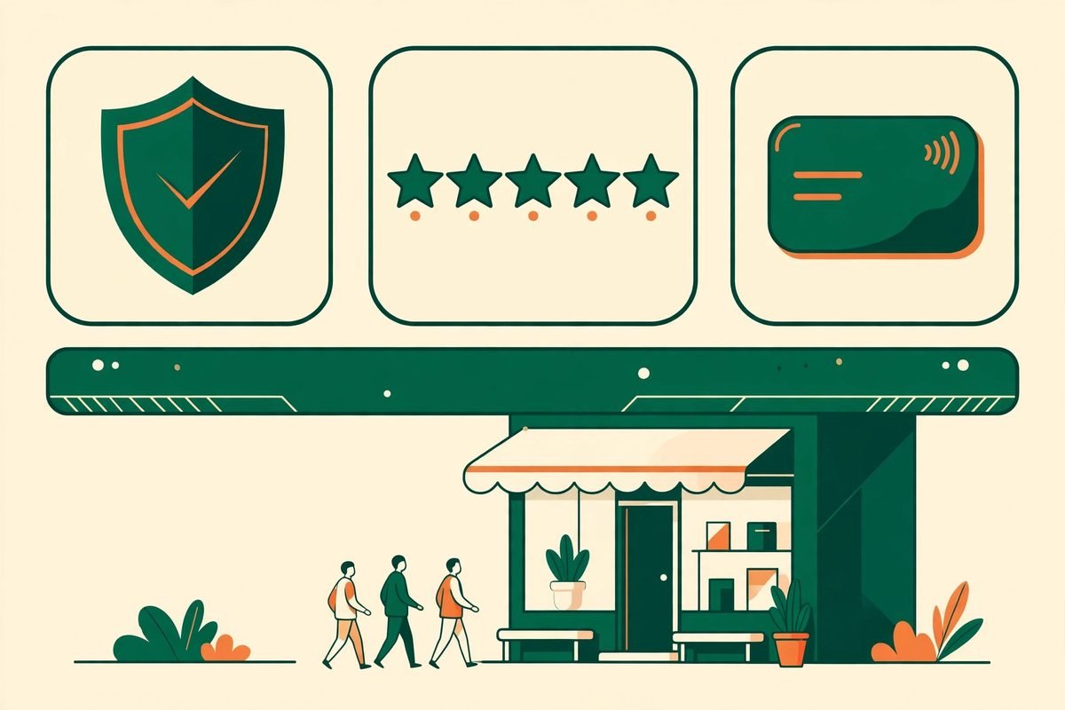
The footer is where doubt goes to be resolved. A visitor who scrolled this far is often one objection away from leaving, and the right trust signals answer those objections without a sales call. The strongest ones are specific, not decorative:
- Proof of real work. A short line such as the number of years you have traded and the number of projects delivered, stated honestly. Vague claims like “industry-leading” prove nothing; concrete, checkable facts do.
- Third-party ratings. If you have genuine Google, Clutch, or platform reviews, show the rating and link to the source. A badge that links nowhere is worse than no badge at all.
- Recognisable payment or partner marks. For ecommerce, payment logos reassure buyers at the exact moment they hesitate. For agencies and B2B firms, technology partner or certification marks do the same job.
- A physical footprint. A city, a registered address, or a phone number with a real area code. Fully anonymous businesses convert worse, and the footer is where anonymity is most visible.
One warning: trust signals only work if they are true and current. An award from six years ago, a testimonial from a company that no longer exists, or a security badge for a certificate that expired will be found out, and the damage is worse than having shown nothing.
Secondary calls to action that actually get used
The biggest footer mistake is repeating the hero call to action word for word. A visitor who ignored “Get a free quote” at the top of the page will not suddenly want it at the bottom. Footer visitors are usually in research mode, so the action that fits them is smaller and lower-commitment:
- A useful download. A pricing guide, a checklist, or a comparison sheet, gated by email if you must, but genuinely useful. This turns an anonymous researcher into a lead you can follow up.
- A newsletter with a stated benefit. “One practical email a month” outperforms “Subscribe to our newsletter” because it answers the only question the visitor has: what do I get, and how often?
- A low-friction contact route. A callback request or a messaging link suits visitors who want a human but not a form. Keep it to one such route, not four competing chat widgets.
- The next best page. For content-heavy sites, a link to a popular guide or a “start here” page keeps the visit alive when the visitor is not ready to talk.
Whatever you choose, give it visual weight. A call to action buried in grey 12-pixel text among forty links is not a call to action. It needs contrast, breathing room, and a button style visitors already recognise from the rest of your site.
Footer SEO: small links, real ranking effects
Footers also carry quiet SEO weight, because their links repeat on every page. That repetition is a double-edged sword. Used well, footer links pass internal authority to your most important pages and help search engines understand your site structure. Used badly, they dilute it.
- Link to pages you actually want to rank. Every footer link is a vote. Spend those votes on service and pillar pages, not on every blog post you ever wrote.
- Use honest anchor text. “Web development services” tells search engines and humans what the page is; “click here” tells them nothing.
- Do not stuff the footer. A hundred keyword-rich links in the footer is a classic over-optimisation pattern, and it reads as spam to humans long before any algorithm notices. Ten to twenty well-chosen links beat eighty indiscriminate ones.
- Keep it crawlable. Real links, not JavaScript-only menus, so search engines and assistive technology can follow them. The sitemap link, if you include one, belongs here too.
Mobile footers: where most footers fail
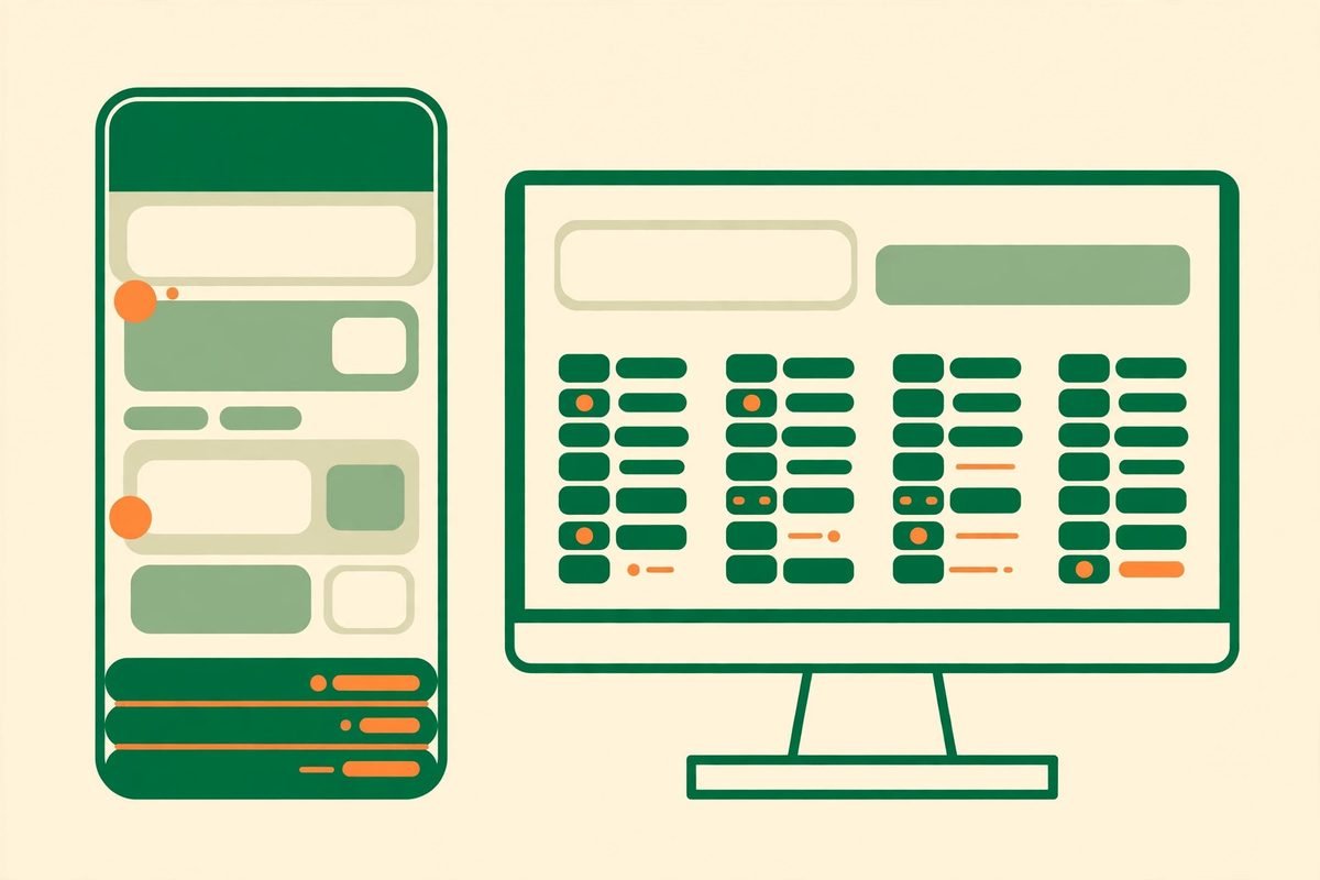
More than half of business-site traffic is mobile, yet most footers are still designed on a desktop screen and then squeezed. On a phone, a five-column footer becomes a very long scroll of tiny links, and the contact details a mobile visitor wants most end up at the very bottom. Three fixes cover most of the damage:
- Collapse columns into accordions. Let visitors expand the section they want instead of scrolling past four sections they do not.
- Put contact first on mobile. A tap-to-call number and a short contact button near the top of the mobile footer match what a phone visitor is actually trying to do.
- Make tap targets genuinely tappable. Links need at least 44 pixels of height and clear separation. If your own thumb keeps hitting the wrong link, your visitors are too.
If mobile is a major channel for you, this is also worth discussing when you plan mobile app development or a mobile-first redesign: the footer is part of the mobile experience, not an afterthought bolted onto it.
From our experience: footer mistakes we keep fixing
After nine years of building and auditing business websites, the same footer problems recur on client sites, and they are almost always cheap to fix. The most common: a copyright line three years out of date, which quietly signals a neglected site; a footer linking to pages that no longer exist, which burns the trust the rest of the page built; a newsletter box that has never been tested, so nobody knows it silently fails on some browsers; and footers so long they push the real content down on short pages, making the site feel bloated.
The other recurring mistake is treating the footer as finished. It is the cheapest block on your site to test. Change one thing at a time, the newsletter offer, the contact route, the order of columns, and watch footer clicks and form submissions for two to four weeks. We have seen a single change, swapping a generic newsletter box for a specific downloadable guide, double footer-sourced leads on a service site. You will not know which change matters on your site until you measure it, so set up footer link tracking before you redesign, not after.
Frequently asked questions
Should every page have the same footer?
Almost always yes. A consistent footer is a navigation and trust anchor: visitors learn where to find contact details and key pages, and search engines get a stable picture of your site structure. The exception is a dedicated landing page with a single conversion goal, where a stripped footer can reduce distraction, but even there, keep contact details and legal links.
How many links should a footer contain?
For most business sites, ten to twenty links is the sweet spot: enough to cover services, company, and contact, few enough to scan in seconds. If your footer needs more, group the extras behind accordions on mobile and ask whether each link earns its place by serving a real visitor task.
Does footer content affect SEO?
Yes, but indirectly. Footer links distribute internal authority to the pages they point to, and honest anchor text helps search engines understand those pages. Footer text itself rarely ranks. The SEO risk runs the other way: keyword-stuffed mega-footers look manipulative and dilute the links that matter.
Should the footer repeat the main call to action?
Not word for word. Footer visitors have already passed on the main offer, so give them a smaller next step that fits research mode: a guide download, a newsletter with a stated benefit, or a callback request. Keep the main call to action available, but let the secondary action do the work.
How often should we update the footer?
Review it quarterly and whenever your services, contact details, or legal pages change. Check for dead links, expired badges, and an out-of-date copyright year at the same time. A footer that is visibly stale undermines the credibility the rest of the site worked to build.
The footer is the most overlooked conversion asset on most business websites, precisely because it is on every page and therefore easy to ignore. Audit yours this week: cut the dead links, state your contact details plainly, add one trust signal you can prove, and give researchers a smaller next step than a quote request. Then measure it for a month. If the footer still is not earning its place, talk to our team and we will review it with you, honestly, before recommending any redesign.