
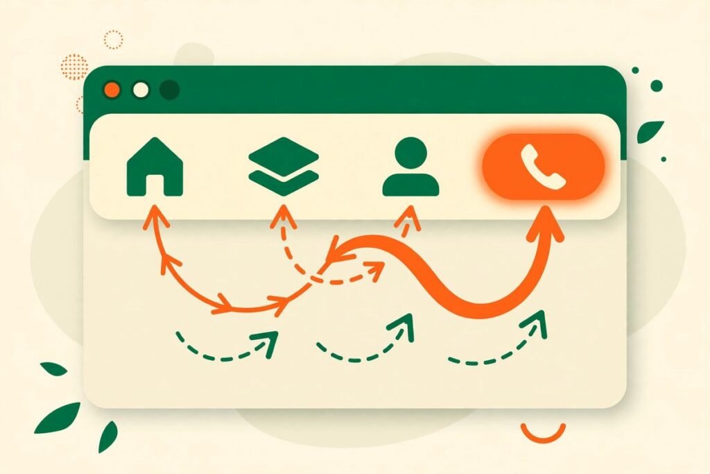
Website navigation menu best practices are not about clever design. They are about removing doubt. When a visitor lands on your site, they are trying to answer three questions as quickly as possible: am I in the right place, where do I go next, and how do I contact this business? If your menu answers those questions in seconds, more visitors stay, explore, and enquire. If it does not, they leave — often without ever telling you why. This guide is for business owners who want a menu that works, not one that merely looks tidy: by the end, you will be able to audit your navigation and build a clear path from any page to a genuine enquiry.
At MTD Technologies, we have spent more than nine years building websites for service businesses, shops, and software products, and navigation is one of the first things we review on any existing site. The businesses losing enquiries rarely have a traffic problem. They have a wayfinding problem: too many menu items, labels written for internal teams rather than customers, and contact details buried three clicks deep. Fixing those issues usually matters more than a new homepage banner.
Website Navigation Menu Best Practices: Start With the Visitor’s Job
Good navigation starts before you open your website builder, with a list of the jobs visitors are trying to do. For most business sites, that list is short: understand what you offer, check whether you are credible, see prices or examples, and get in touch. Every main-menu item should serve one of those jobs; if it does not, it belongs in the footer, on a sub-page, or nowhere.
Write the list in your customers’ words, not your org chart. A visitor does not care whether a service sits in “Solutions” or “Capabilities”. They care whether they can find “Web Design” or “Mobile Apps” without guessing. Internal language is the most common navigation mistake we see: teams know what “Digital Transformation” means to them, but a prospective client reading it on a menu often does not.
- List the five to seven tasks visitors most often complete on your site.
- Match each task to exactly one menu item, using the words visitors already use.
- Move everything else to a secondary location, such as the footer or a landing page.
- Test the result on someone outside your team and watch where they hesitate.
That last step matters more than any checklist. Give someone outside your team a task — “find how much a website costs” or “contact this company” — and say nothing while they try. Every pause or wrong click is your menu telling you where it fails.
Keep the Main Menu Short, Ordered, and Honest
A main menu is not a sitemap. It is a shortlist. Aim for five to seven top-level items on desktop, and fewer if your labels are long. Faced with twelve options, most people scan the first few, skip the rest, and fall back on search or the back button.
Order matters almost as much as length. Put the pages visitors need most at the start and end of the menu, where eyes land first and last. For a service business, that usually means services early and contact at the end, kept visible rather than hidden inside a dropdown. Do not bury your strongest conversion page under a vague parent label.
Be honest about what sits behind each label. “Services” is acceptable when it leads to a clear overview page. It is not acceptable when it opens a dropdown of twenty near-identical links with no descriptions. If a dropdown is needed, keep it to one level, group related links under plain headings, and make every parent item clickable. Visitors on touch devices cannot hover, and keyboard or screen-reader users should never be trapped by a mouse-only menu.
Name Menu Items for Customers, Not for Departments
Menu labels should describe the destination, not the department that owns it. “Our Solutions” could mean anything; “Web Development” tells a visitor exactly what they will find. Familiar words are not boring; they are fast. Visitors do not want to learn your vocabulary before they can use your site.
Avoid format labels as well. “Blog” and “Downloads” describe what something is, not why a visitor would want it. If your blog answers buying questions, label the section by its value — for example, “Guides”. The same logic applies to menu buttons: “Get a Quote” outperforms a generic “Contact” link when the visitor is ready, because it names the next step.
Consistency is part of naming. Use the same label for the same destination everywhere: header, footer, buttons, and page titles. If the menu says “Pricing” but the page heading says “Investment”, visitors wonder whether they clicked the wrong link. Keep labels short — one to three words where possible — and stable across pages.
Design Depth So No Important Page Is More Than Three Clicks Away
Depth is where good menus quietly fail. A site can have a tidy top-level menu and still hide its best pages four or five levels down. As a working rule, a visitor should reach any important page — a service, a product category, or contact details — within three clicks of the homepage. That does not mean every page must be in the main menu; your menu, in-page links, and footer must work as one system.
Breadcrumbs help on deeper sites. A trail such as Home, Services, Web Development tells visitors where they are and gives them a one-click route back to a parent page. On long service pages, in-page links and a clear end-of-page next step matter just as much: end with a short summary, a contact button, and links to the two or three pages a serious buyer reads next.
Search is part of navigation, not a substitute for it. If your site has more than a few dozen pages, add clearly labelled site search in the header. But do not use search as an excuse for a confusing menu: repeated search terms are often the labels your menu is missing.
Make Mobile Navigation a First-Class Design, Not a Shrunken Desktop Menu
Most business websites now receive the majority of their visits on phones, yet mobile navigation is still treated as an afterthought: the desktop menu is simply collapsed behind an icon. Dropdowns that need hovering do not work, long menus push contact far down a scrolling panel, and tap targets are too small for thumbs.
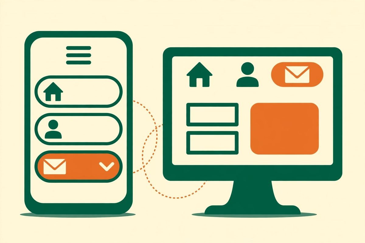
Design the mobile menu separately. Label the toggle clearly — the word “Menu” beside the icon helps visitors who do not recognise the hamburger symbol — and open a full, readable panel rather than a cramped strip. Make each link tall enough to tap comfortably, keep contact visible without scrolling, and avoid nesting more than one level deep.
Sticky headers deserve care on mobile. A header that stays visible keeps navigation and contact within reach on long pages, but a tall sticky header eats screen space on a small phone. The compromise we use is a slim sticky bar with the logo, menu toggle, and one contact button, with the full menu one tap away. Test it on a real phone, not just a resized browser window.
Build Every Path Toward Contact — Without Nagging Visitors
Navigation should lead toward contact, but it should not shout at every turn. The balance is a persistent, polite route: a contact item in the main menu, a clear call to action in the header, a relevant next step at the end of service pages, and full contact details in the footer. Both ready buyers and researchers need that route to be obvious at the moment they decide.
Place contact details where visitors look for them. The footer should carry a phone number or email address, a location if relevant, and opening hours if they affect response times — not just a link to a form. On service pages, match the call to action to the page: “Discuss your website project” is clearer than a generic “Contact Us”. And keep forms short: a twelve-field form undoes the good work of a clear menu.
If you are planning a new site, ask your agency how navigation was tested, not just how it looks. Our web development services start with that visitor-task list, because structure decisions made in week one are far cheaper than a menu rebuild after launch. The same thinking applies to apps: clear in-app navigation follows the same rules, which is why our mobile app development work treats the first three taps as a conversion path, not decoration.
From Our Experience: The Navigation Mistakes That Cost Enquiries
Three mistakes recur across the sites we audit. The first is the mega-menu that tries to show everything. A dropdown with forty links looks comprehensive in a design review and overwhelming to a visitor who has ten seconds. We cut these menus down to grouped overviews, each linking to a landing page, so visitors can finally see the next step.
The second mistake is hiding contact behind a label nobody clicks. We have seen sites where the only contact link lived inside an “About” dropdown, and others where a sticky contact button overlapped the form it was meant to promote. Check your own site on a phone: can you reach a short form within two taps from any page?
The third mistake is never revisiting navigation after launch. Services change, pages are added, and menus quietly grow. A quarterly review — a task test with one outsider and a look at which menu items nobody clicks — prevents that drift. If an item gets almost no clicks, check whether its label is unclear, its destination is weak, or it belongs in the footer. If you are unsure what belongs in your menu, contact us and we will review your current structure before you commit to a redesign.
Frequently Asked Questions
How many items should a website navigation menu have?
Five to seven top-level items works well for most business sites. Fewer is better when labels are long or the audience is mainly on mobile. If you need more, use a clear overview page or footer links rather than stretching the main menu, and always keep contact visible.
Should contact be in the main menu or only in the footer?
Both. Put contact in the main menu and as a header button so ready buyers never have to hunt for it, and repeat full details in the footer for visitors who scroll to the bottom of a page. Hiding contact in the footer alone loses the visitors who decide mid-page.
Are dropdown menus bad for navigation?
No, but deep or hover-only dropdowns are. Keep dropdowns to one level, make parent items clickable to overview pages, use large tap targets, and ensure the menu works with a keyboard and on touch screens. If a dropdown needs three levels, your site structure probably needs simplifying first.
What is the best mobile navigation pattern?
A clearly labelled menu panel with short, tappable links, one level of nesting at most, and a contact action that does not require scrolling. Test it on a real phone, check thumb reach, and keep a slim sticky header so navigation stays reachable on long pages without crowding the screen.
How do I know if my navigation is losing enquiries?
Run a task test: ask someone outside your team to find a service and contact you, and watch where they hesitate. Combine that with analytics — menu items nobody clicks, high exits from service pages, and repeated site searches for pages your menu should surface — and you will usually find one or two fixes that matter most.
Navigation is not a detail to settle once and forget. It is the system that turns visits into conversations. Keep it short, name it in your customers’ words, keep important pages close, design mobile properly, and make contact reachable from everywhere. Do those things well, and your menu starts doing the job it was built for: moving the right visitors toward getting in touch.