
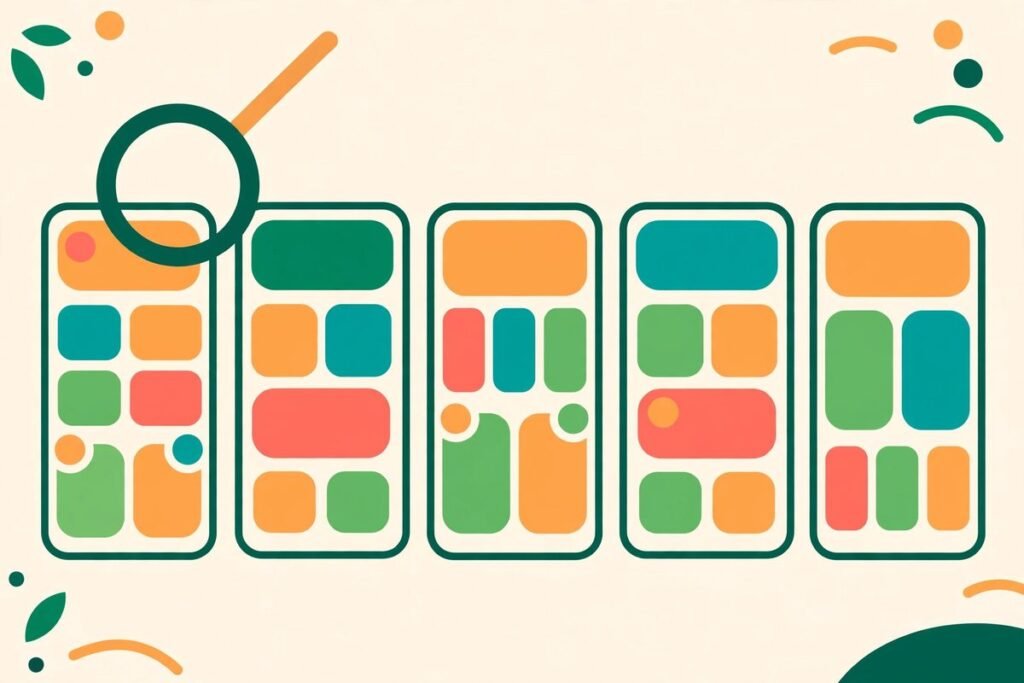
If your app gets impressions but not installs, your screenshots are usually the problem. App store screenshots conversion optimization turns those few frames into a pitch a stranger grasps in about seven seconds: what the app does, who it is for, and why it is worth the tap. Most users never read your description. They scan the first three frames, compare you with the apps next to you in search, and decide. This guide gives you the 8-frame test we run before any launch, plus an A/B testing plan that tells you whether the new set actually converts better.
This is written for founders and product teams about to ship or relaunch an app. You will finish it able to audit your own screenshots, reorder them into a story, and set up a test that measures installs, not opinions.
Why app store screenshots conversion optimization matters more than your description
Search results show your icon, your title, and your first screenshots — the whole pitch for most visitors. Roughly half of users decide whether to keep looking based on the first three frames, which carry most of the conversion weight. A weak first frame is not rescued by a brilliant frame seven, because most people never scroll that far.
Screenshots also do double duty: a higher install rate from the same impressions strengthens the listing for the keywords already driving traffic, because stores read conversion as a quality signal. It is the cheapest install growth most apps have: no new ad spend, no new feature, just a better presentation of the product you already built.
From our experience, the most common failure is not ugly design: it is a set ordered the way the team built the features, not the way a stranger needs to hear them — settings screen first, empty state second, login page third. Nobody installs a login page. Sell the outcome first, explain the mechanics later.
The rules before the test: real UI, readable headlines, one idea per frame
Before you sequence anything, clear three hard rules. First, Apple requires screenshots to show the actual app in use, and both stores reject sets that misrepresent the experience. Use real states with realistic data, not marketing art or screens your app cannot produce.
Second, design for thumbnail size. In search results your screenshots render roughly 120 pixels wide, and only the headline is legible. Every frame needs one headline of five words or fewer that sells the outcome, not the feature.
Third, one idea per frame: one annotation, one highlighted button, one benefit. Two ideas become visual noise at thumbnail size, and noise reads as a complicated app. If a frame needs a paragraph to explain itself, the frame is wrong. Cut it or split it.
Specs to build to: on iOS, design for the 6.9-inch iPhone (1320 x 2868 pixels) and 13-inch iPad (2064 x 2752), since Apple downscales from the largest size; Apple allows up to 10 per device type. On Google Play, phone screenshots run 1080 pixels on the short side up to 3840 on the long side, with 2 to 8 allowed, and the 1024 x 500 feature graphic sits above them as frame zero. Confirm current sizes in App Store Connect and Play Console before export.
The 8-frame test: the sequence we run before launch
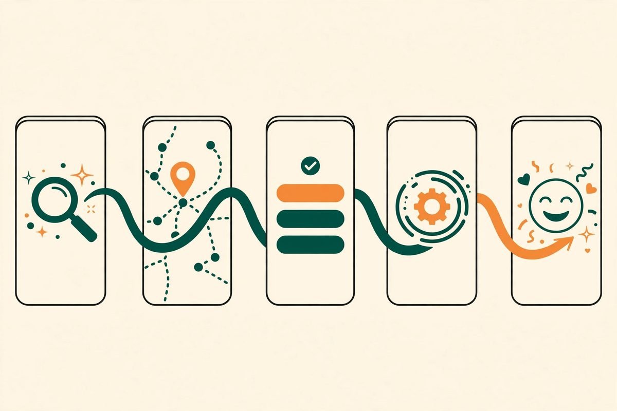
We use eight frames: enough to tell a complete story, and a set that ships unchanged on both stores (iOS allows ten, Google Play eight). Here is what each frame must prove.
- Frame 1 — the outcome. The single result your best users care about, shown in the product. This frame carries the install decision alone. If it fails, nothing else matters.
- Frame 2 — the core action. The one thing a user does most often, mid-flow, looking effortless. This answers “what will I do in this app?”
- Frame 3 — the proof or the differentiator. The reason to pick you over the lookalike next to you in search: a result, a comparison, or a capability competitors lack.
- Frame 4 — the second feature that matters. The feature your reviews and support tickets say people love second. Not the feature your roadmap loves most.
- Frame 5 — ease and setup. Show how fast getting started is: import, connect, or a first result in under a minute. This kills the “sounds like work” objection.
- Frame 6 — depth for serious users. The power feature, the history view, the report. This frame speaks to the buyer who scrolled this far because they are nearly convinced.
- Frame 7 — trust and reassurance. Privacy, offline mode, no ads, or export — whichever objection your category raises. Do not invent a trust claim you cannot defend.
- Frame 8 — the invitation. The finished state, the streak, the calm inbox. End on the life after installing, not on a settings page.
Run the test in two passes. First, the thumbnail pass: shrink the set to search-result size and read only the headlines in order. If they do not tell a coherent story alone, rewrite them before touching the design. Second, the sequence pass: show the set to a stranger for ten seconds, then ask what the app does and who it is for. If they cannot answer both, your order is wrong or your first frame is vague.
iOS versus Android: one story, two executions
The story stays the same, but the execution splits. iOS audiences tend to respond to outcome and lifestyle framing, and Apple renders device frames prominently. Android audiences tend to reward feature clarity and platform-native UI: an app that looks like an Android app, with Material patterns and system gestures, builds trust faster than one that looks ported from iOS. On Google Play, the feature graphic is effectively frame zero — treat it as part of the pitch, not an afterthought.
Localisation is the other split teams underestimate. Translating captions is not localising a set: German copy runs longer than English, Arabic reads right to left, and some scripts need larger vertical spacing, so English layouts overflow or crowd in other languages. Ship per-language layouts for your top markets, using Apple’s per-storefront localised screenshots, rather than one English set everywhere.
From our experience, the practical rule is: one story, two exports, localised layouts for your top two non-English markets.
From our experience: the mistakes that quietly cost installs
Across client launches, the same five mistakes recur. First, leading with a login, onboarding, or empty state. Nobody installs an empty state. Second, cramming every feature into the first three frames so none reads at thumbnail size. Third, mixing background styles, typefaces, or colour families across the set, which reads as amateur. Fourth, showing fake data the real app cannot produce, which risks rejection and teaches new users to distrust the product. Fifth, shipping the set once and never revisiting it: creative fatigue is quiet, and teams often notice declining installs months after users stopped responding.
When not to invest heavily here: if your app has almost no store traffic, screenshot work will not create demand. Fix discovery first, then optimise the page people land on. Screenshots convert interest; they do not create it.
A/B testing your screenshots: PPO on iOS, experiments on Google Play
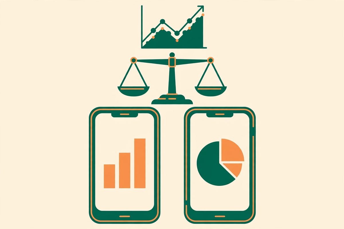
Opinion is not a testing method. On iOS, Apple’s Product Page Optimization lets you test up to three treatments of icon, screenshots, and preview videos against your default page, for up to 90 days, with results at 90 percent confidence — see this PPO screenshot test guide for the setup. On Google Play, Store Listing Experiments test icon, feature graphic, screenshots, and short description, and Google recommends at least seven days or until one variant reaches a 90 percent probability of being the best. Test one variable at a time — a new first frame, a new order, or new captions — or you will not know what moved the number.
Start with the highest-leverage variable: the first screenshot. In published benchmark data, the first screenshot is the winning variable in just over half of screenshot tests, and the median winning test lifts conversion by around 12 percent. Run at least seven to fourteen days and roughly 25,000 impressions per variant before calling a winner, longer if traffic is thin. Watch page-view-to-install conversion first, and impression-to-page-view rate second, so you can tell whether a variant wins on the product page or merely attracts different traffic.
Record every test the way you would record a product experiment: hypothesis, variant, audience, dates, impressions, conversion, and decision. “We think an outcome-led first frame converts better than a feature-led one” is a hypothesis. “The new set looks better” is not. Over a year, that log becomes your most valuable screenshot asset, because it records what users actually responded to.
One honest caveat: testing needs traffic. Small apps with a few hundred page views a week will take months to reach significance on a subtle change. Test bigger swings — a different first frame, a different headline promise — rather than nudging one word of caption and waiting a quarter for noise. If traffic is too thin to test, ship the 8-frame sequence, audit it on a calendar, and revisit testing when volume allows.
Your pre-launch checklist
- Headlines tell a story at thumbnail size, five words or fewer per frame.
- Frame 1 sells the outcome alone; no login or empty state leads the set.
- Every frame shows real app UI; nothing the app cannot produce.
- One idea per frame, one annotation at most, consistent colours and typeface.
- Eight frames in story order, exported at the largest required size.
- iOS and Android executions differ where platforms differ; feature graphic is frame zero on Play.
- Localised layouts for top markets, not just translated captions.
- A test planned before launch: one variable, a hypothesis, a minimum runtime, a decision rule.
- An owner and a review date, so the set is audited every six to ten weeks.
Frequently asked questions
How many app store screenshots should I upload?
Apple allows up to 10 per device type and Google Play allows 2 to 8 phone screenshots, but most high-performing listings use 5 to 7 per locale, with the first 2 to 4 carrying most of the weight. Our 8-frame test ships unchanged on both stores. More frames do not help if the first three fail.
What size should app store screenshots be?
Design for the largest required size and let the store downscale: 1320 x 2868 pixels for the 6.9-inch iPhone, 2064 x 2752 for the 13-inch iPad, and at least 1080 pixels on the short side for Google Play phone screenshots. Confirm current sizes in App Store Connect and Play Console before export.
Can I use marketing art instead of real app screens?
No. Apple requires screenshots to show the app in use, and both stores reject sets that misrepresent the experience. Design headline, background, and device frame around real screens with realistic data.
How do I A/B test screenshots?
On iOS use Product Page Optimization in App Store Connect: up to three treatments, up to 90 days, results at 90 percent confidence. On Google Play use Store Listing Experiments, running at least seven days or until a variant reaches 90 percent probability of being the best. Test one variable at a time.
How often should I refresh my screenshots?
Audit every six to ten weeks, and sooner after a UI redesign, a conversion drop, or a competitor change. Refresh the first three frames most often, since fatigue shows there first.
Screenshots are the cheapest install growth most apps leave on the table. Run the 8-frame test before your next launch: outcome first, one idea per frame, real UI throughout, and a test that proves the new set converts. If you would like a second pair of eyes on your set, talk to MTD Technologies — we build and launch apps through our mobile app development team. You can also browse our AI Tools Directory for app marketing and testing tools.