

This mobile app accessibility WCAG guide is written for app teams who want to ship apps that everyone can use, not just pass an automated scan. It covers the checks that catch the most real users: contrast, touch targets, screen reader labels, focus order, motion, and authentication. Work through it during design and development, when problems are cheap to fix, instead of after launch when they are expensive and embarrassing.
The same work also helps everyone else: someone holding a phone one-handed on a bus, reading in bright sunlight, or recovering from an injury. Build these habits into your normal definition of done, and accessible becomes the default, not a separate workstream.
Mobile App Accessibility WCAG Guide: The Core Checklist
The Web Content Accessibility Guidelines (WCAG) are the closest thing the industry has to a shared standard. WCAG 2.2 is the current version, and Level AA is the target most teams should aim for: Level A is the floor, Level AAA is aspirational, and AA is where the practical, testable requirements live. WCAG was written for web content, but its principles map directly to native apps through the platform guidelines from Apple and Google.
Do not treat WCAG as a checklist you tick once. Use it as a design input: the criteria that matter most on mobile are the ones users hit every session — can they read the text, can they hit the button, can their screen reader make sense of the screen, and can they complete the task without a gesture their body cannot perform. The official WCAG 2.2 specification is the primary source, and a plain-language WCAG 2.2 checklist is useful for turning it into tickets your team will actually read.
Contrast and Text That People Can Actually Read
Contrast is the single most common accessibility failure in mobile apps, and the easiest to prevent. WCAG AA requires a contrast ratio of at least 4.5:1 for normal text and 3:1 for large text. That applies to body copy, button labels, form placeholders, and error messages. Placeholder text is a repeat offender: a light grey that looks elegant in a mockup is unreadable on a real phone in daylight. If your placeholder does real work, it is content, and it must meet the ratio.
Colour alone must never carry meaning. A form field that turns red on error, with no icon and no message, tells a colour-blind user nothing. Pair colour with text, an icon, or both: an error message that says what went wrong and how to fix it. The same applies to charts and status indicators: a green dot for success and a red dot for failure needs a label, or that information does not exist for many users.
Text sizing is the other half of readability. Users change their system font size for good reasons, and your layout must survive it. Support Dynamic Type on iOS and font scaling on Android, and test your screens at the largest sizes, not just the default. Text must resize up to 200 percent without clipping, overlapping, or forcing horizontal scrolling — failures you will only catch by testing at the extremes. Build layouts with flexible containers, not fixed heights, and treat a clipped label as a bug with the same severity as a crash.
Touch Targets, Gestures, and Motor Access
WCAG 2.2 criterion 2.5.8, Target Size (Minimum), requires targets of at least 24 by 24 CSS pixels at Level AA, with spacing rules that let a smaller target pass only if there is enough room around it. Treat 24 pixels as the floor, not the goal: Apple recommends 44 by 44 points and Google Material Design 48 by 48 density-independent pixels, and those larger numbers are what real thumbs need. Icon-only buttons, close icons, and kebab menus fail this most often — a 16-pixel icon with no padding is a target nobody can hit reliably.
Spacing matters as much as size: a delete button wedged against save turns a small motor slip into lost work, so give destructive actions extra room. Test on a real phone, not just a simulator — hold it one-handed, use your non-dominant hand, and try your core flows. If you mis-tap twice, your users will too.
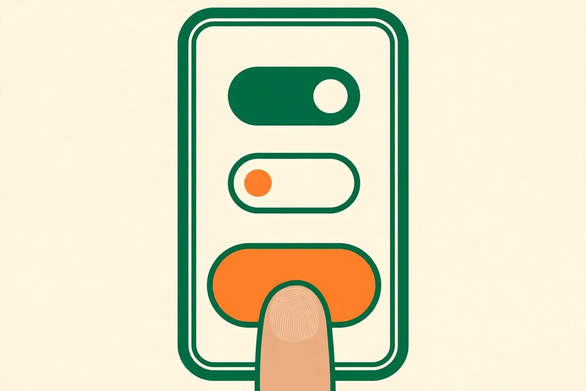
Gestures need alternatives. WCAG 2.5.7 requires a single-pointer alternative for anything that needs a drag or a multi-point gesture: swipe-to-delete needs a delete button, drag-to-reorder needs up and down controls, pinch-to-zoom needs a zoom button. This is not just about disability — a user with a broken wrist, a user holding a child, and a user on a bumpy train all benefit from a simple tap alternative. If a gesture is the only way to do something, that feature is broken for a meaningful share of your audience.
Screen Readers, Labels, and Focus Order
VoiceOver on iOS and TalkBack on Android are how millions of people use apps, and they expose every labelling shortcut a team takes. Every interactive element needs an accessible name that says what it does, not what it looks like: a button labelled “arrow” tells a user nothing, while “Go to checkout” tells them everything. Icon-only buttons are the worst offenders. Decorative images should be hidden from assistive technology, and meaningful images need descriptions that convey the information, not just “image”.
Focus order is the screen reader equivalent of visual layout. When a user swipes through a screen, the order should follow the visual and logical flow: header, content, primary action, secondary action. Focus that jumps randomly, lands on hidden elements, or gets trapped inside a modal is disorienting and, for some users, a dead end. When a modal opens, focus should move into it; when it closes, focus should return to the element that opened it. Sticky headers and overlays must not hide the focused element — the point of WCAG 2.4.11, Focus Not Obscured.

Headings and structure matter inside apps too. Group related controls, label form fields explicitly rather than relying on placeholder text, and announce state changes a sighted user would see instantly: a form error, a successful save, a finished load. A user who submits a form and hears nothing has no idea whether it worked. Every visual feedback needs an announced equivalent.
Motion, Timing, and Authentication Traps
Motion is a genuine barrier, not a preference: parallax, auto-playing animation, and flashing content can cause nausea, dizziness, or seizures. Respect the system reduce-motion setting, never flash content more than three times per second, and provide a static equivalent for any animation that carries meaning.
Time limits deserve the same scrutiny. Session timeouts that log a user out mid-form, verification codes that expire in sixty seconds, and carousels that advance before anyone can read them all punish users who read slowly, navigate by switch control, or get interrupted. Where a time limit exists, let users extend it and warn them before it expires. WCAG 2.2 also tightened authentication: criterion 3.3.8, Accessible Authentication, means login must not depend on solving a cognitive test such as a puzzle with no alternative. Allow password managers, paste, passkeys, and email links — a login flow that blocks paste is an accessibility failure and a security anti-pattern at once.
From Our Experience: Shipping Accessibility Without Slowing the Release
In over nine years of building apps, the pattern is consistent: accessibility costs almost nothing in the design system and a great deal as a retrofit. Teams that ship accessible apps do three boring things: they put contrast and touch-target rules in the design system, add accessibility labels to the component library so developers get them free, and test one core flow with VoiceOver or TalkBack every sprint instead of saving all testing for the end.
Two gotchas catch almost every team. The first is the custom component: a beautiful date picker, slider, or toggle that is invisible to assistive technology because nobody gave it accessibility traits, roles, or values. Prefer platform components; when you build custom, budget accessibility into the same ticket. The second is the third-party SDK: chat widgets, payment sheets, and ad units that ignore your settings and break focus order. Vet SDKs before you integrate them.
One thing to avoid entirely: accessibility overlay widgets that promise compliance with a single line of code. They do not fix labelling, focus order, or gesture alternatives, and they can interfere with the assistive technology people already use. Fix the source instead. Level AAA across the board is rarely the right goal for a consumer app — ship a solid AA, fix the real user journeys first, and improve from there.
Testing Checklist Before You Ship
Automated scanners catch perhaps a third of accessibility issues. Worth running, but not a verdict. Use this sequence before every release:
- Run an automated scan on every screen, and fix every contrast and missing-label issue it reports.
- Turn on VoiceOver or TalkBack and complete your three most important flows with the screen off.
- Set system font size to the largest setting and check every screen for clipping and truncated actions.
- Turn on reduce motion and dark mode, and confirm nothing breaks or becomes unreadable.
- Complete signup, login, and checkout using only a keyboard or switch control where the platform supports it, and with paste enabled.
- Test on at least one low-end Android device, not just a flagship: performance and layout problems cluster there.
- Ask someone who uses assistive technology daily to try the app. One hour of that feedback beats a month of guessing.
Record the results in the same place you record other QA. Accessibility regressions are regressions: a release that breaks screen reader navigation should be treated like a release that breaks checkout, because for some users it is exactly that. If you need help building accessibility into an existing app, our mobile app development team builds and audits apps with these checks baked into the process, and you can talk to us about an accessibility review of your current product.
Frequently Asked Questions
Is WCAG legally required for mobile apps?
There is no single global law that says “follow WCAG”, but in practice WCAG AA is the benchmark regulators, courts, and large customers point to. The Americans with Disabilities Act is increasingly applied to digital products in the United States, and the European Accessibility Act extends duties to many digital services in the EU. Targeting AA is the safest practical position.
What is the minimum touch target size in a mobile app?
WCAG 2.2 AA requires at least 24 by 24 CSS pixels, but aim higher in practice: Apple recommends 44 by 44 points and Google recommends 48 by 48 density-independent pixels. Use 44 to 48 as your design-system default, and treat anything smaller as an exception that needs a documented reason.
Do I really need to test with a screen reader?
Yes. Automated tools cannot judge whether a label makes sense, whether focus order is logical, or whether a state change is announced. A fifteen-minute VoiceOver or TalkBack pass over your core flows catches problems no scanner will find.
Does accessibility slow down app development?
It slows down retrofits, not development done properly. When contrast rules, touch targets, and labels live in the design system and component library, developers get them by default. The expensive version is discovering a hundred issues in a pre-launch audit. Build the checks into each sprint and the marginal cost drops to near zero.
Will an accessibility overlay widget make my app compliant?
No. Overlays cannot fix missing labels, broken focus order, or gesture-only interactions, and they can interfere with the assistive technology your users already rely on. They also create a false sense of compliance that does not survive a real audit or a real user test. Fix the underlying app instead.
Accessibility is not a feature you add at the end; it is a quality bar for the whole product. Start with contrast, touch targets, labels, and focus order, test with real assistive technology, and keep the checks in your definition of done. If you want a second pair of eyes on your app, get in touch with MTD Technologies and we will help you prioritise the fixes that matter most.